This is the first of a few posts I’m planning on making, going over some behind the scenes process for all my comics!
PLOTTING
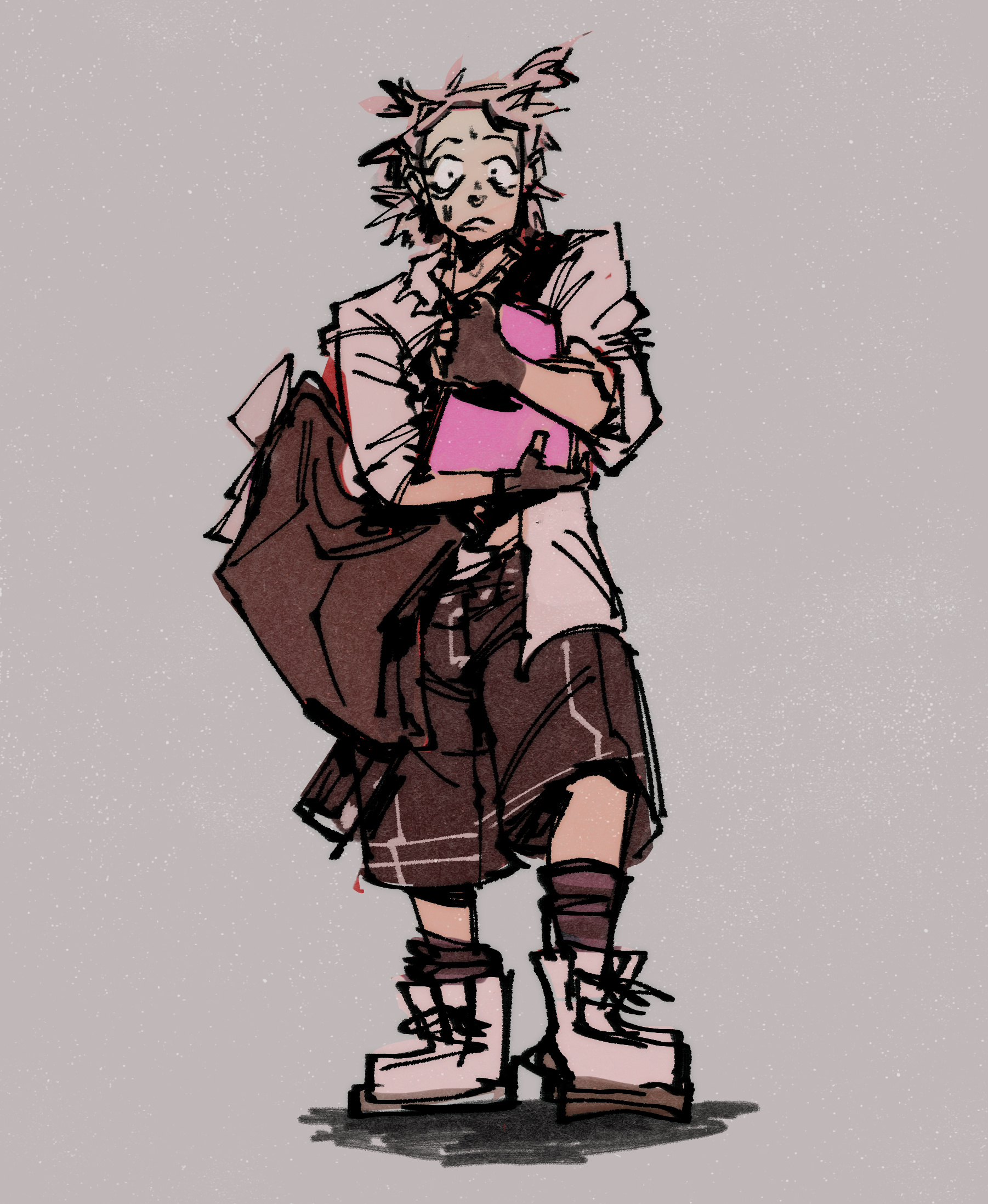
The general plotline for Ry Carpenter has a Bad Day (or RChaBD, as I’ll be abbreviating it) has been slowly brewing since the end of 2022. There’s some “lore” aspects (Cass and Vincent doing set crew together in HS; Jas and Cass being in a defunct band; Ry and Vincent being roommates) that have stuck around for even longer. Originally the “inciting incident” (aka the Prophetic Band Dream) was going to be from Ry getting her wisdom teeth out and having an adverse side effect to the meds they gave her (basically a fever dream). I ended up switching this out for a similar fever dream with a different cause (staying up all night working on her portfolio). I do think (unfortunately) the Art Student realness is important to the origin story. Though, neither Vincent nor Ry are nepo babies with trust funds or whatever, they’re debt-riddled like me (yaaay…). This doesn’t really come up in the comic, but Vincent was a Printmaking major at the same school that Ry is finishing up at the start of the RChaBD (they’re a year older). It just makes sense in my mind.
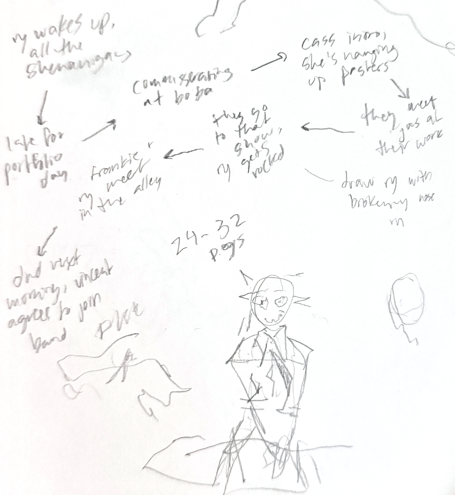
According to the patreon archives, this is about when I started really thinking about making this story finalized. The text from the above drawing read: “the ry is from the origin story i have planned, basically ry has a very vivid dream which leads to a Very Bad Morning, where she has to rush to try and get to a portfolio review and…well…you’ll have to wait and see if she makes it lol. “
I had a sudden image at one point of Vincent and Frankie playing DND together, and it just made sense to me. Vincent and Jas being minimum wage employees who get together to talk shit is also something that’s been part of their dynamic since 2022.
The location is *loosely* based on my own place of residence, Portland, Maine. I’m not totally committed to them being from Portland, that might get retconned…though, I am committed to them being from the Northeast, that just feels right to me. But, the map you see and some of the locations (Ry and Vincent’s apartment, the boba tea shop Vincent works at, vaguely the art school + record store + punk venue) are inspired by ones I know well. I won’t tell you where Ry and Vincent’s apartment is (would be doxxing friends I know IRL), but the boba shop is inspired by the real Uncharted in Portland, and the punk venue is based on Geno’s Rock Club.
THE PAGES
For RChaBD, I’d say my biggest inspirations were Opening Band by Levi Prewitt (aka Levitzo), as well as my usual comic inspos (Leo Fox, E.M. Carroll, John Hendrix, etc.). I really loved Opening Band in particular—IDK if Levi’s selling copies of it still, but would recommend if you can get your hands on a copy.
I simultaneously wanted to try something Different while having to bend to the time constraints I had going on (full time employment, booo, tomato tomato). So, I mainly addressed this through the length. It being shorter allowed me to build my comic muscles in other ways. Mainly: color; more than like 2 characters; lots of dialogue; and humor. Whether or not I was fully successful in all of these…idk! To be so real (as can be seen in the archive of my newsletters), I started kinda late because I was waffling between ideas, which I think hindered my output (or at the very least, impacted the way I feel about the comic. But I’m hoping that time will heal that a bit)
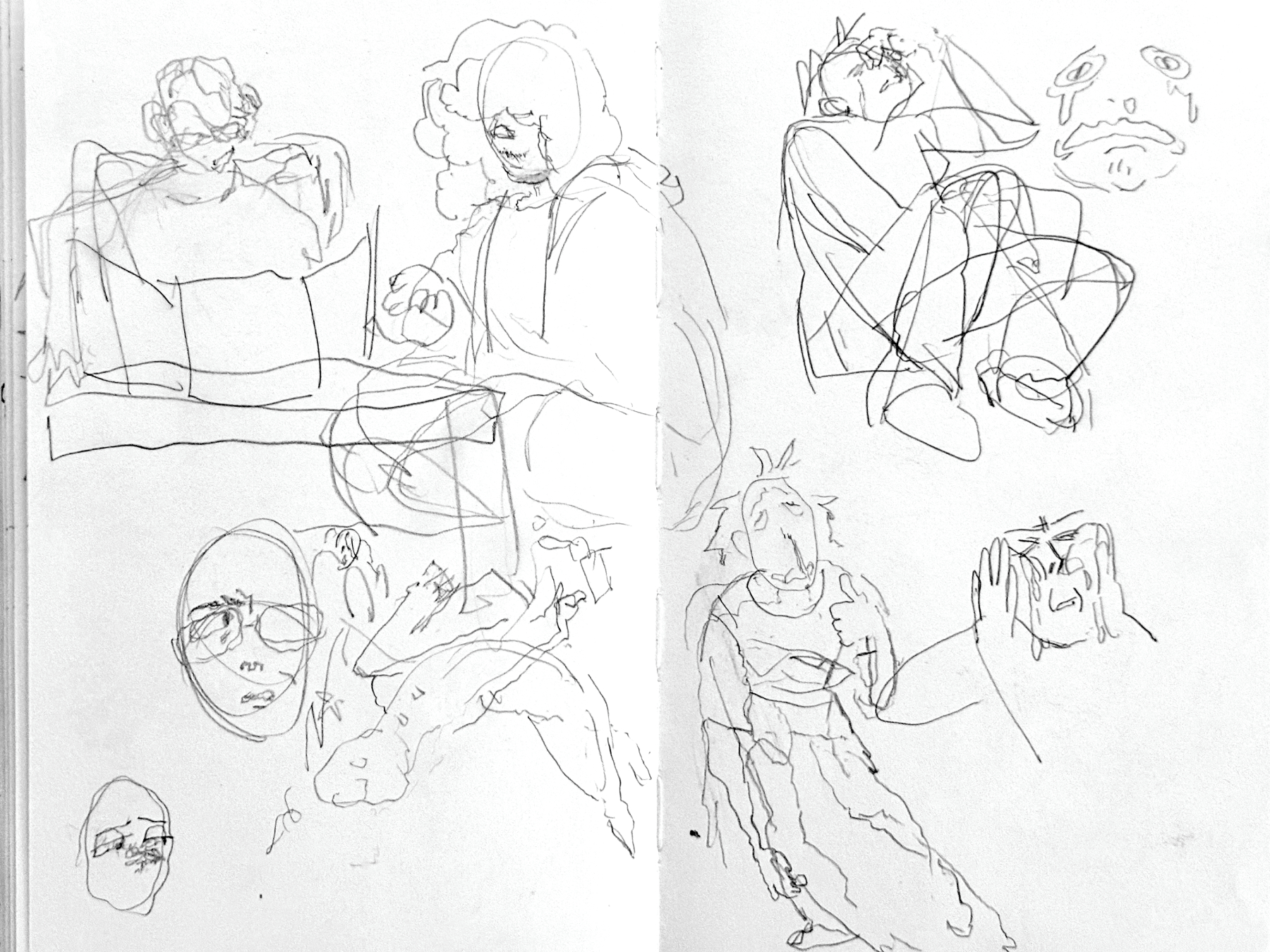
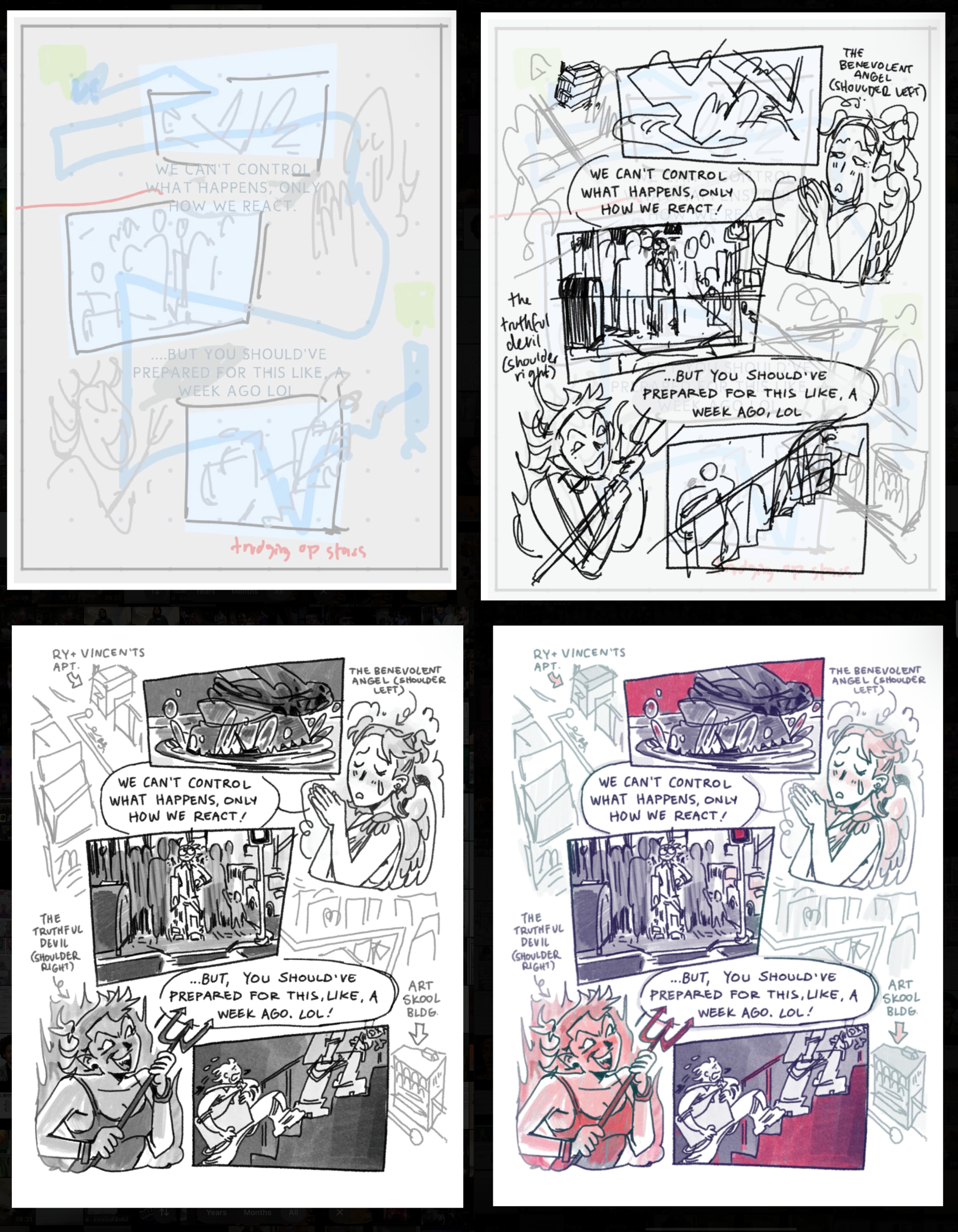
The basic format that I followed was: writing out all the plot beats (specific and generic); thumbnailing and refining the text based on these beats (and the overall length I had in mind); rough sketching the whole thing; placing text (I used a font I had made of my own handwriting…but ended up writing over that anyways, just because I think the font looks too artificial); finishing one test page; and then finishing the rest (using the process of: text → final sketch → inks → shading → color overlay (purple and green) → accent color overlay (red) → texture overlay/finishing touches). I’ll include some screenshots below. I did the color in this way (fully rendering the page in B+W, and using blending modes to apply the color on top) to try to standarize the coloring process (as someone who’s really only made B+W comics), but honestly I think it just made it more complicated lol. I’d like to continue exploring color in my comic work, but lowkey I think I might have a preference for B+W comics (which is kinda funny, because everywhere outside of comics, I LOVE color. To be explored further I guess!)
THE COVER
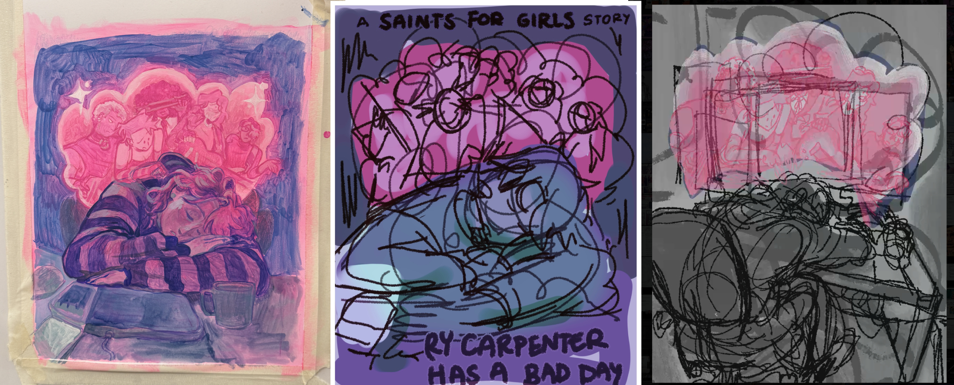
I was strugglinggg with the cover for a while. I wanted to do it traditionally at first and then scrapped it for a digital thing and the digital thing took forever…basically, suffering <3 I’m planning on making a youtube video with all the timelapses of the pages and the cover, so be on the lookout for that.
The traditional cover was actually painted over with one of my favorite paintings I’ve made (in transit 3), which you can watch the process for on my youtube channel